



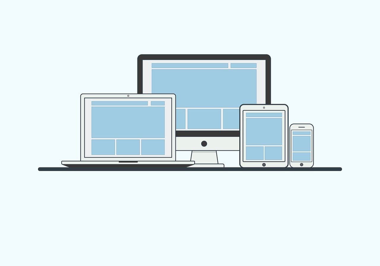

What is responsive design?
Responsive design is a design method that ensures that a web app or website automatically adapts to different screen sizes and devices. In practice, this means that the content, layout and functionality look good and work optimally, whether the user visits the site from a mobile phone, tablet, laptop or large screen.
This approach avoids the need to create separate versions of a website or app for different devices.
How does responsive design differ from other design methods?
Two terms that are often compared to responsive design are adaptive design and fixed design:
Responsive design vs. adaptive design
Adaptive design involves creating several predefined layout versions adapted to specific screen sizes. Although it also addresses cross-device usage, adaptive design is less flexible than responsive design because it requires specific breakpoints and layout options for each device.
Responsive design, on the other hand, adapts fluidly and dynamically to all screen sizes, without the need for multiple separate layout versions.
Responsive design vs. fixed design
Fixed design uses fixed pixel-based values, which means that the content does not adapt to different screen sizes. This can lead to a poor user experience on devices with smaller or larger screens than the original layout was designed for.
Why is responsive design important for web apps?
Responsive design has become an indispensable part of modern web development, and it is especially important for websites. In an age where people use everything from smartphones to large screens to access digital services, web apps must be adaptable to deliver a good experience on all devices.
The increasing use of mobile devices has made it critical for websites to function smoothly on small screens. Regardless of whether the user is surfing on the go with a mobile phone or sitting comfortably in front of a large screen, apps and content are expected to scale and adapt.
Responsive design also offers great benefits for the user experience (UX). A responsive website that works well on all devices signals professionalism and user-centered design.
Basic principles of responsive design
Responsive design is about creating websites and web apps that adapt to different screen sizes and devices. To achieve this, there are three central principles that form the foundation for a responsive design: flexible grids and layout, flexible images and media, and the use of media queries.
Flexible grid and layout
A flexible grid is at the heart of responsive design, and it enables the content to adapt to different screen sizes without it becoming cluttered or losing functionality.
Instead of fixed pixel values, flexible grids use percentage-based sizes to define the width of columns and other layout components. This provides a more fluid fit that looks good on both small and large screens.
Two of the most popular technologies for creating flexible grids are CSS Grid and Flexbox. CSS Grid gives developers the ability to create complex, two-dimensional layout structures that can be easily customized.
Flexbox, on the other hand, is particularly useful for handling layout in one dimension, whether horizontal or vertical.
Flexible images and media
Images and videos also need to be flexible to ensure they display correctly across devices. A fixed image that is not scaled correctly can lead to a poor user experience, especially on smaller screens.
For more advanced solutions, especially in terms of performance, you can use HTML attributes such as srcset for images. This allows the browser to select the most appropriate image version based on the device's screen size and resolution.
Use of media queries
One of the most important techniques in responsive design, media queries are a way to change CSS based on the screen size of the device being used. This means you can customize the look and behavior of your web app for different devices without having to create separate versions.
Common breakpoints for media queries:
- Small screens (mobile): Max width of 576px.
- Medium screens (tablets): Max width of 768px.
- Large screens (laptop and desktop): Min width of 992px.
Best practices for responsive design in web apps
In order to create a web app that works optimally on all devices, it is important to follow some key principles and strategies. Here are three essential best practices that can help you implement responsive design in an efficient and user-friendly way.
Prioritize mobile-first approach
A mobile-first approach involves designing and developing for small screens first, then expanding functionality and layout for larger screens. This approach ensures that your app works on the most limited devices, which are often mobile phones, before adding more complex features and elements for larger screens.
This strategy is effective because it forces developers to focus on essential content and critical features. In addition, it provides better performance, as it avoids overloading the app with unnecessary elements for small screens.
Testing on multiple devices
Even the most well-thought-out design can behave unexpectedly on specific devices. Therefore, extensive testing is essential to ensure that your web app looks good and works properly on everything from small smartphones to large screens.
Tools like Chrome DevTools allow you to easily simulate different screen sizes and test breakpoints directly in the browser. For more extensive testing, especially on actual devices, services like BrowserStack and Sauce Labs can provide access to a wide range of virtual devices and browsers.
Performance and loading time
Responsive design can affect the performance of your web app, especially if it uses heavy images, complex CSS rules, or unnecessary JavaScript elements. Optimization is therefore a critical part of the process.
To reduce the loading time, you can use techniques such as:
- CSS and JavaScript Minification: Remove unnecessary spaces and comments to reduce file size.
- Lazy loading: Load images and media only when they are actually visible to the user.
- Optimizing images: Use modern image formats such as WebP and implement srcset to deliver images adapted to the device's resolution.
Tools and frameworks for responsive design
Developing responsive design for web apps can be challenging without the right tools and frameworks. Fortunately, there are many resources that make the process easier and more efficient. Here are some of the most important tools and frameworks that can help you create a user-friendly and responsive web app.
CSS Framework
CSS frameworks like Bootstrap and Foundation are among the most popular choices for responsive design. These frameworks offer pre-defined grids, components and stylesheets that make it quick and easy to build responsive designs without having to code everything from scratch.
Design tools
Before you start coding, it's important to plan and visualize how your design will look. Modern design tools such as Figma, Adobe XD and Sketch make it easy to create responsive design already in the planning phase.
This is how you get started with responsive design
Getting started with responsive design can seem overwhelming for beginners, but with a structured approach, the process becomes both manageable and efficient. Here's a step-by-step guide to help you build a solid foundation for responsive design, along with some helpful tips to avoid common mistakes.
1. Plan your design with a mobile-first approach
Start by designing for the smallest screens first. This forces you to focus on the essential content and functionality. Once you have a solid foundation for small screens, you can expand your design for larger screens with more details and elements. Think about what your users need most, and prioritize this in the layout.
2. Use a flexible grid
Build your layout with a flexible grid based on percentage values instead of fixed pixel values. This ensures that elements scale evenly across screen sizes. CSS Grid or Flexbox are excellent tools for creating responsive grids. Start with a simple structure and expand it as needed.
3. Implement media queries
Media queries are key to responsive design as they allow you to adjust CSS styles based on screen size. Define clear breakpoints based on the needs of the design, not specific units. Avoid overcomplicated media queries with too many unnecessary variations. Keep them simple and focus on the most critical adjustments.
4. Optimize images and media
Ensure that images and videos are scaled correctly without reducing performance. Use the max-width: 100% CSS property to ensure that media never exceeds the width of the container. For further optimization, implement srcset for images and use modern image formats like WebP.
5. Test on multiple devices and browsers
Responsive design must be carefully tested to ensure it works on all screen sizes and browsers. Use tools like Chrome DevTools for quick testing and services like BrowserStack for accessing virtual devices. Also test in both portrait and landscape mode to uncover any issues.
Frequently asked questions
What is the difference between responsive design and adaptive design?
Responsive design adapts fluidly to all screen sizes using flexible grids and media queries, while adaptive design relies on predefined layout options for specific screen sizes. Responsive design is more flexible and forward-looking, as it does not require manual adaptation for new devices.
Why is mobile-first approach important in responsive design?
A mobile-first approach prioritizes design and functionality for small screens, which are often the most limited platform. This ensures that essential content and important functions are always available. Web design can then be expanded for larger screens with additional functionality and details.


